CLIENT
Tauzer ApiariesBRIEF
Since 1861 the Tauzer Family Homestead has evolved and innovated to meet changing agricultural demands. Their family farm is entirely solar powered and they are committed to sustainable harvesting. With the established success of their apiary, they decided to expand into retail with their natural bee byproducts.SOLUTION
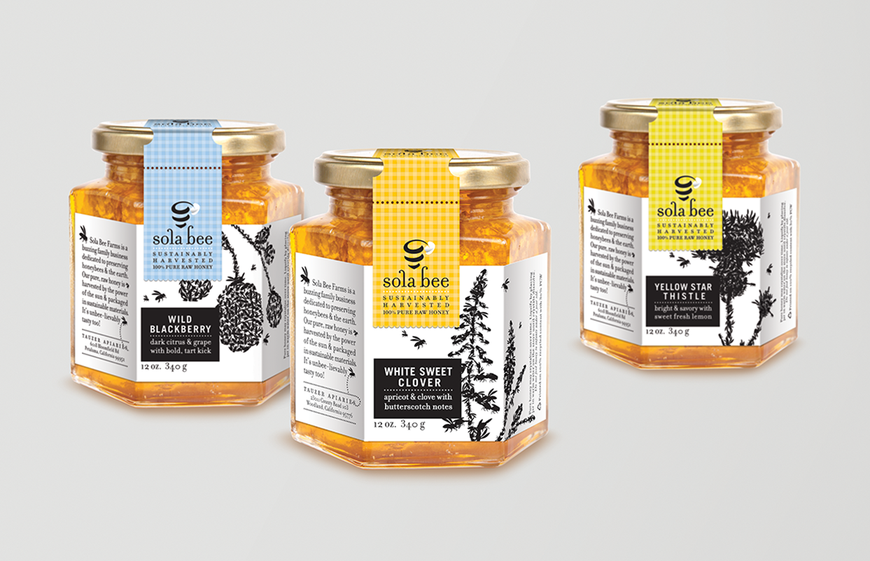
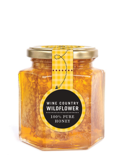
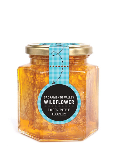
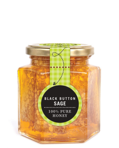
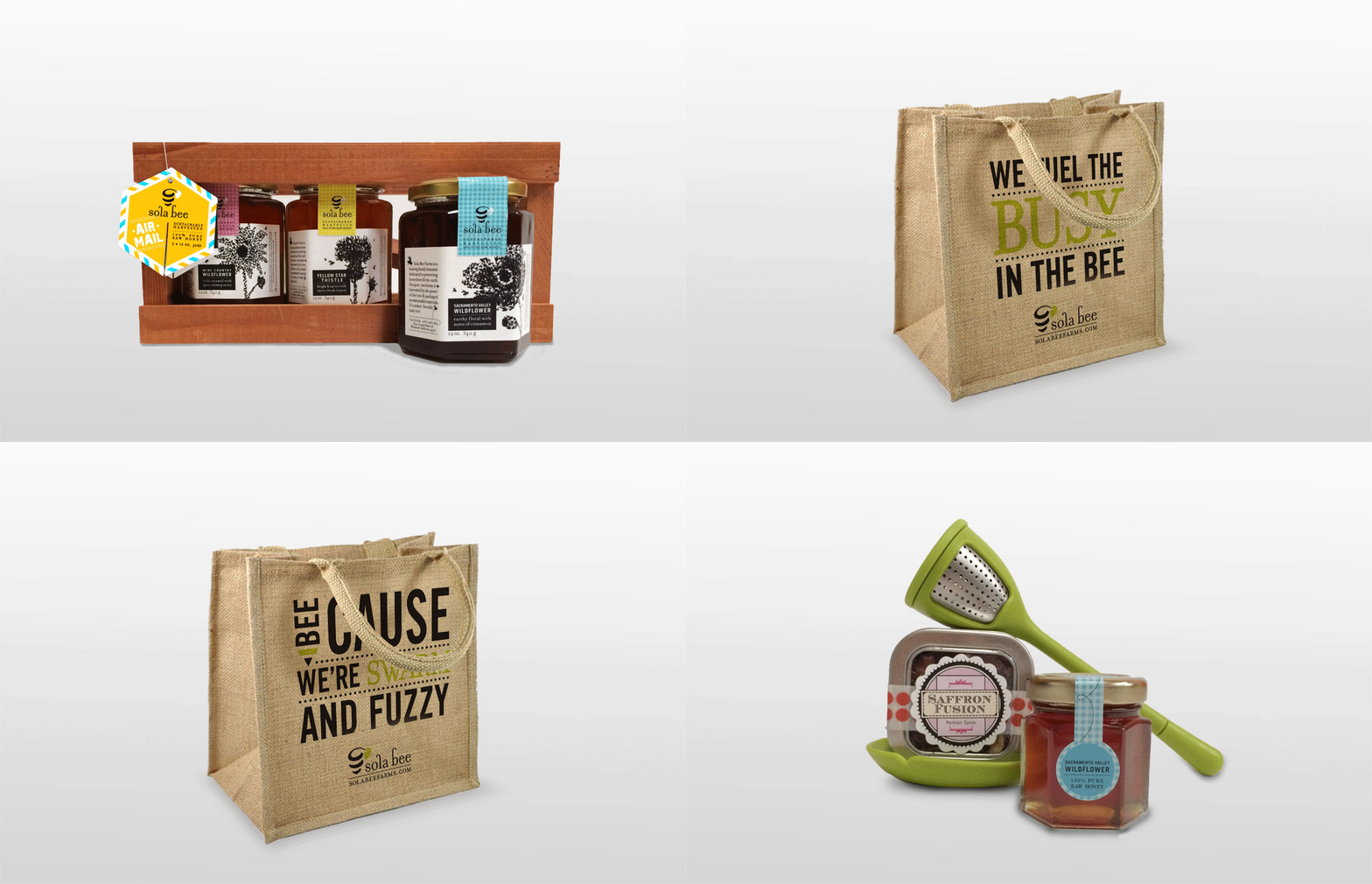
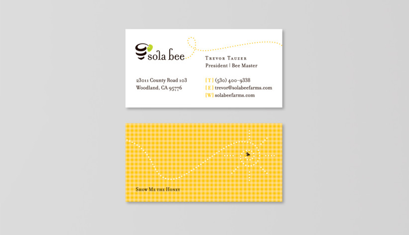
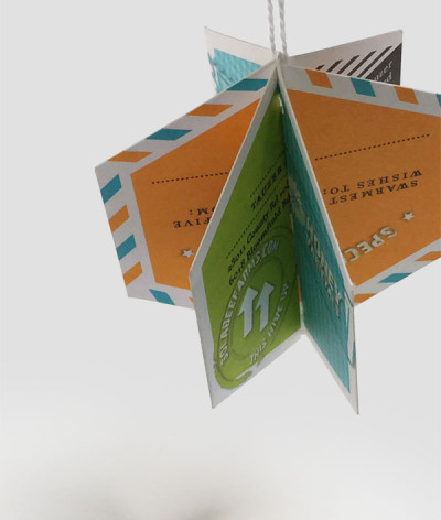
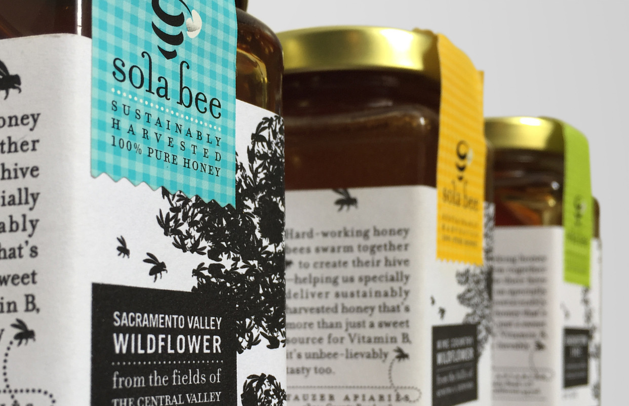
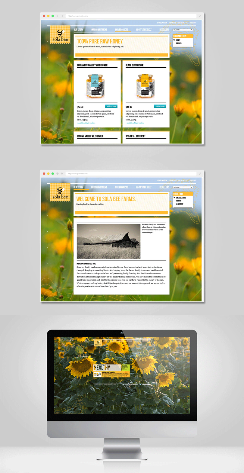
UNIT focused the brand strategy around three pillars; small family farm, sustainable practices, and healthy products. The name, "Sola Bee," derives from the sun needed to create pollen and the solar energy the farm harnesses to harvest their honey. A vine-like icon helps communicate Sola Bee’s green mission, while also referencing the shape of a hive and stripes of a bee. The ascenders on the typography playfully depict bee antennae. Honeybees are the only bee that swarm to collaboratively create their hive, so the packaging illustrates bees flying together to define the florals that make up each varietal. Gingham picnic patterns gives a family canning feel, while providing a tamper seal and differentiating flavors on shelf. All packaging and print materials using 100% post consumer waste products for an eco-conscious solution.RESULTS
Since its launch, Sola Bee has been overwhelmed with requests from local wineries and boutique stores interested in stocking the honey. They were introduced to a nearby Whole Foods for inclusion as a "local product," and within 3 months, they quickly expanded to numerous other locations.CLIENT
Tauzer ApiariesBRIEF
Since 1861 the Tauzer Family Homestead has evolved and innovated to meet changing agricultural demands. Their family farm is entirely solar powered and they are committed to sustainable harvesting. With the established success of their apiary, they decided to expand into retail with their natural bee byproducts.
SOLUTION
UNIT focused the brand strategy around three pillars; small family farm, sustainable practices, and healthy products. The name, "Sola Bee," derives from the sun needed to create pollen and the solar energy the farm harnesses to harvest their honey. A vine-like icon helps communicate Sola Bee’s green mission, while also referencing the shape of a hive and stripes of a bee. The ascenders on the typography playfully depict bee antennae. Honeybees are the only bee that swarm to collaboratively create their hive, so the packaging illustrates bees flying together to define the florals that make up each varietal. Gingham picnic patterns gives a family canning feel, while providing a tamper seal and differentiating flavors on shelf. All packaging and print materials using 100% post consumer waste products for an eco-conscious solution.
RESULTS
Since its launch, Sola Bee has been overwhelmed with requests from local wineries and boutique stores interested in stocking the honey. They were introduced to a nearby Whole Foods for inclusion as a "local product," and within 3 months, they quickly expanded to numerous other locations.

