CLIENT
Bamboo AsiaBRIEF
Bamboo Asia offers a unique assortment of Vietnamese, Indian, and Japanese street fair, all at individual, made-to-order stations leveraging the highest quality ingredients and spices. UNIT was selected to develop a clear, authentic story that appeals to the adventurous working professionals, along with venture capitalists interested in helping them to extend to multiple locations.SOLUTION
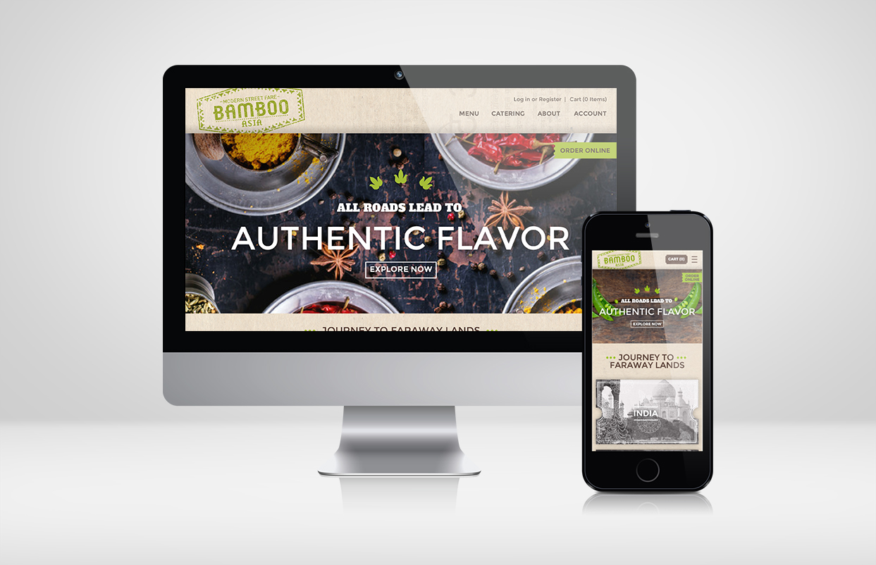
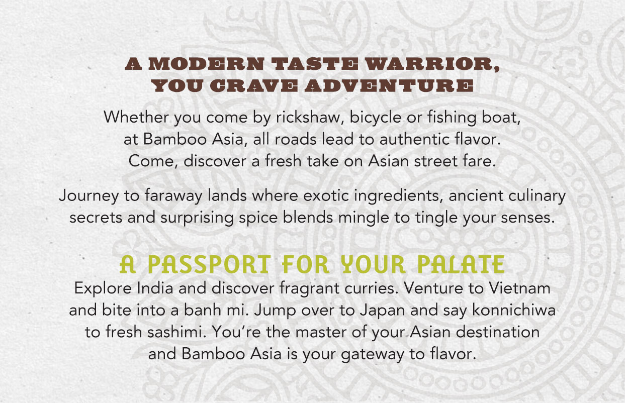
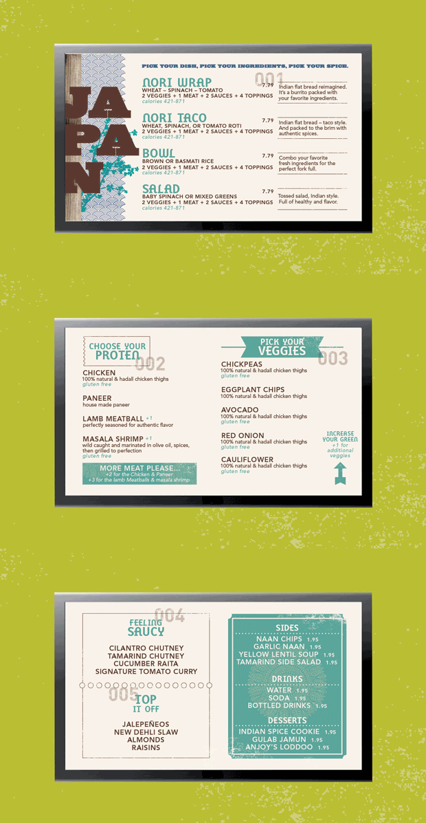
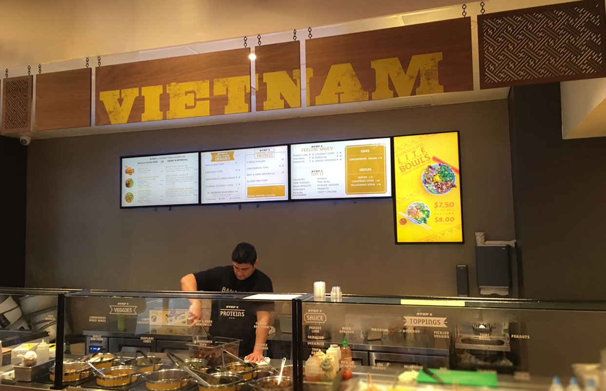
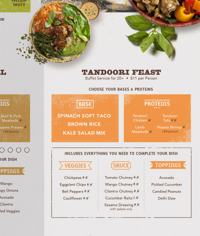
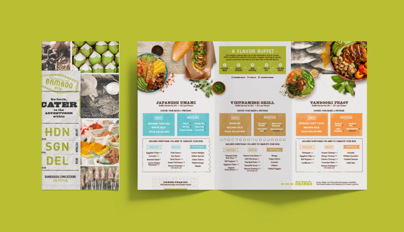
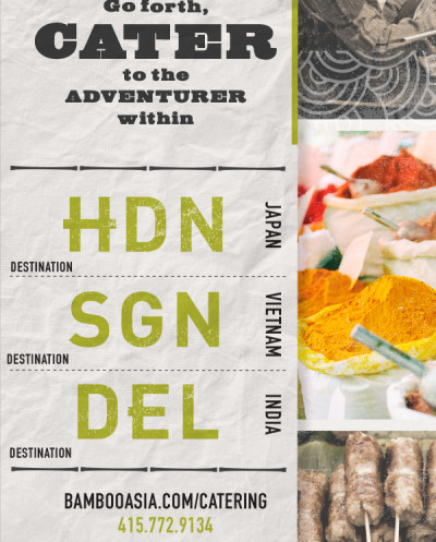
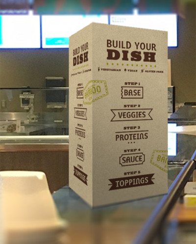
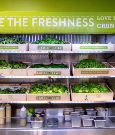
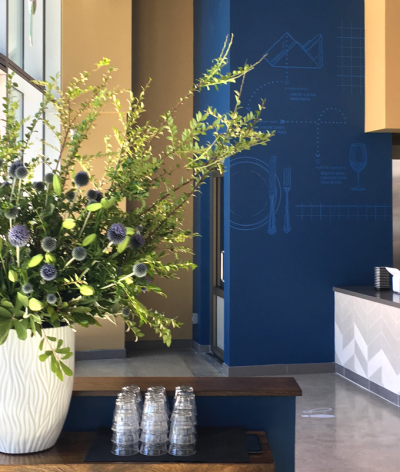
UNIT replaced their existing stark, modern interiors with a more traditional Asian street food market experience. While the brand is still in transition, small changes continuously set the stage for a sensory overload that sends your palate on various journeys abroad. The new brand utilizes a passport stamp logo, and then extends to murals showcasing Asian markets with bountiful produce and spices. Traditional patterns are carved out of wooden banners flanking each station ceiling, and simplified menus guide you through the ordering process. The website and catering brochure use travel queues to invite guests to join the experience.RESULTS
As the brand slowly transitions, they have been in talks with various capital options. In the meantime, guests have a more authentic connection with their story and menu ordering has simplified considerably, helping limit the congestion of lunchtime rush – positioning them for more tickets and higher ticket averages.CLIENT
Bamboo AsiaBRIEF
Bamboo Asia offers a unique assortment of Vietnamese, Indian, and Japanese street fair, all at individual, made-to-order stations leveraging the highest quality ingredients and spices. UNIT was selected to develop a clear, authentic story that appeals to the adventurous working professionals, along with venture capitalists interested in helping them to extend to multiple locations.
SOLUTION
UNIT replaced their existing stark, modern interiors with a more traditional Asian street food market experience. While the brand is still in transition, small changes continuously set the stage for a sensory overload that sends your palate on various journeys abroad. The new brand utilizes a passport stamp logo, and then extends to murals showcasing Asian markets with bountiful produce and spices. Traditional patterns are carved out of wooden banners flanking each station ceiling, and simplified menus guide you through the ordering process. The website and catering brochure use travel queues to invite guests to join the experience.
RESULTS
As the brand slowly transitions, they have been in talks with various capital options. In the meantime, guests have a more authentic connection with their story and menu ordering has simplified considerably, helping limit the congestion of lunchtime rush – positioning them for more tickets and higher ticket averages.

