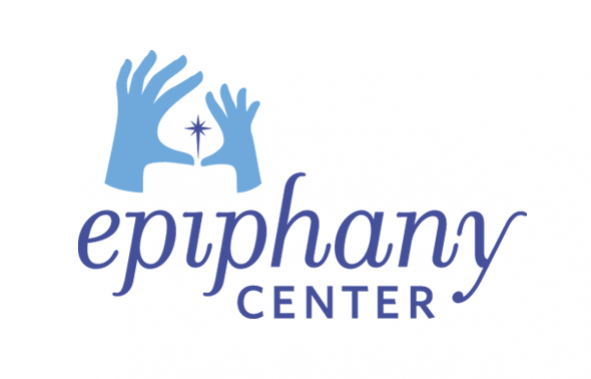
UNIT partners has recently completed a rebrand of Epiphany Center, a holistic community care center. The rebrand includes a logo, stationery system, upgraded website and newsletter.
Initial work on the rebrand began in May 2012. The various brand elements began rolling out in January 2013 with the website launching late summer 2013. The Epiphany Center’s programs and services have adapted over its 160-year history to meet the changing needs of San Francisco’s most vulnerable families. As a result, the agency lacked a visual brand that accurately represents its offerings. The absence of a logo and brand standards had impeded the agency from clearly communicating its purpose and benefits to potential donors, clients, and the community at large.
In order to communicate more effectively, and stay relevant through future evolutions, the new brand was designed to focus on Epiphany Center’s overall objective of serving at-risk families and not specific programs or services.
UNIT focused the brand visual on the importance of the connection between a parent and child on the path to recovery and wholeness. The two hands coming together represent this connection. In addition, the logo itself represents an “epiphany” moment for the viewers as a candle with spark is formed in the negative space between the two hands. This candle represents the guiding light for children and parents on their journey to building strong relationships. The central spark is reflective of the client’s epiphany moment that happens as a result of participation in Epiphany programs. The spark provides a nod to an abstract cross to represent the faith behind the organization.
Continuing the idea of an epiphany moment from the identity, UNIT focused on developing surprise moments throughout the stationery system and website. Each element of the stationery system introduces a relevant part of the Epiphany Center story through its individual reveal.
The website provides a more information-rich reveal with the use of rollovers. On the homepage, they immediately hit the viewer with relevant facts about women and children in need. Upon rollover, they flip that fact with information about Epiphany Center’s results and approach. Throughout the site, images are initially displayed with a depressing tone and again upon rollover they show in true color to provide a hopeful and positive outlook.
UNIT partners helped the Epiphany Center develop an effective visual brand and a communication solution that helps them reach out to clients, employees, donors and the community at-large.

