CLIENT
Hi Neighbor Hospitality GroupBRIEF
Corridor and Corridor Café are Hi Neighbor's third and fourth restaurant concepts. The sister brands live side-by-side in San Francisco's theater district along the Van Ness corridor. Show-going guests need speedy ordering, but still appreciate the details of quality dining. The restaurant provides walk-up ordering, but a traditional waited service once you find your seat. Meanwhile the café offers coffee and quick bites. They wanted the visuals to clearly communicate the dualities of quick service and fine dining to help guests grasp the non-traditional concept.SOLUTION
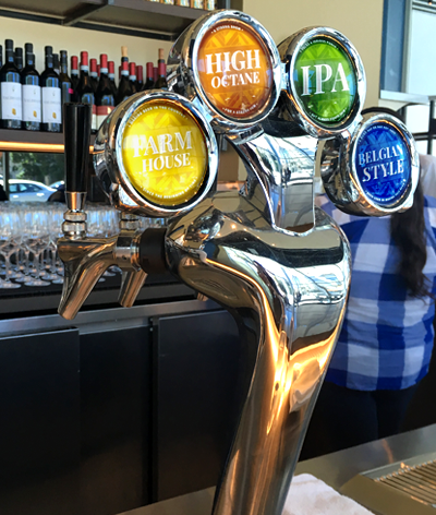
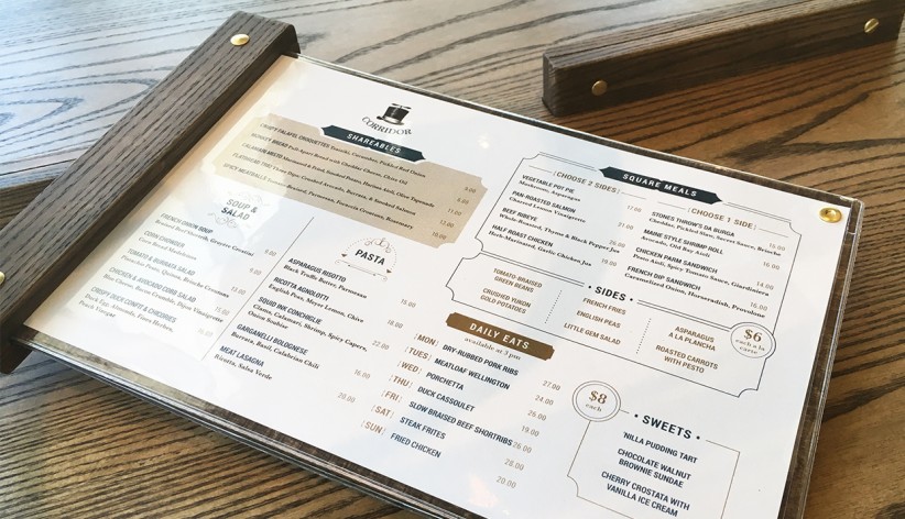
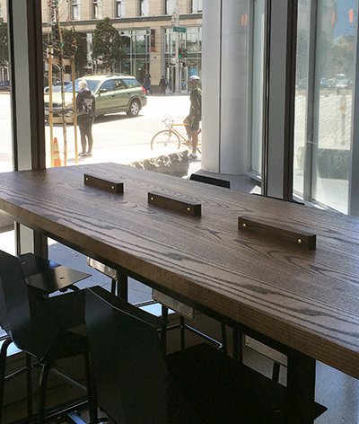
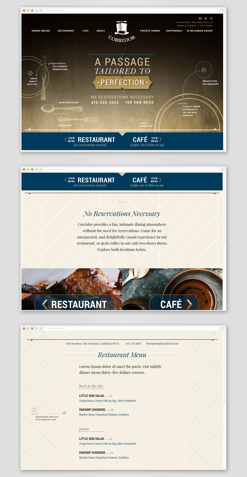
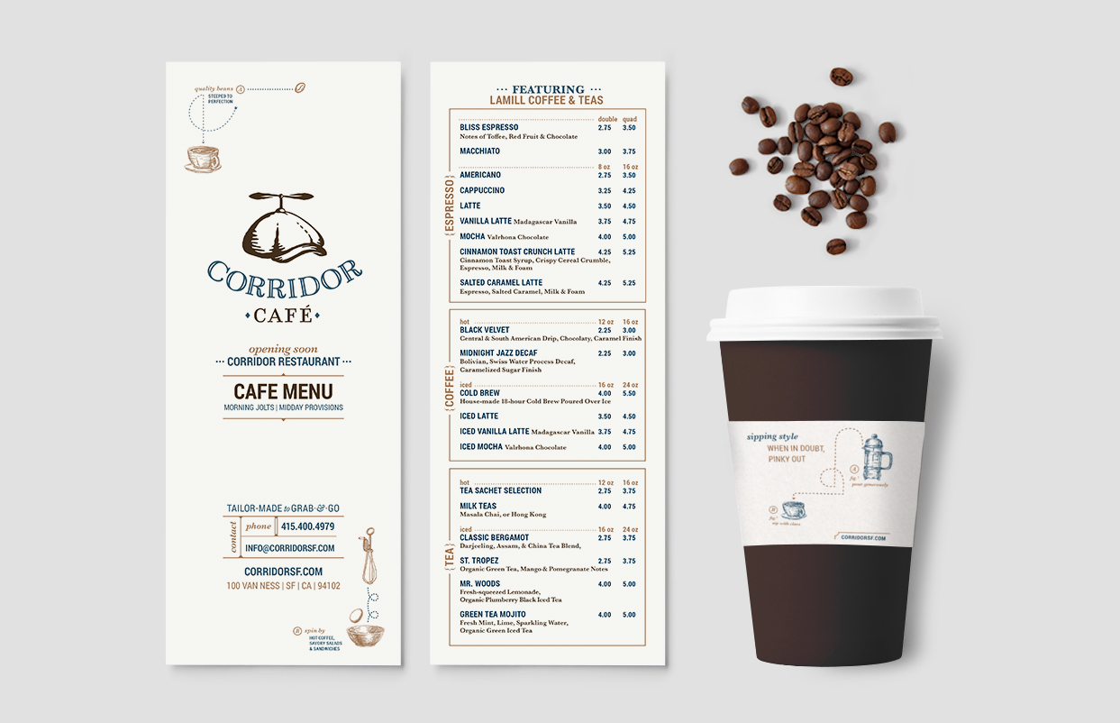
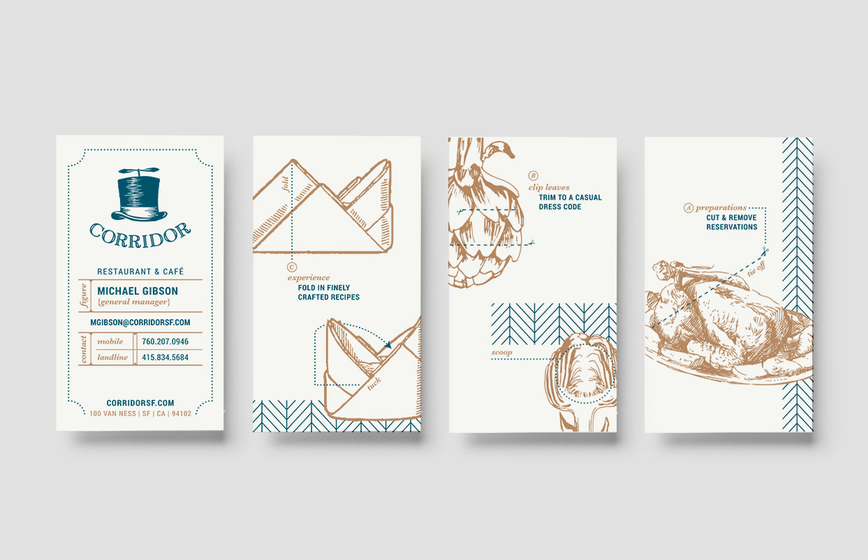
The top hat logo with spinning upper provides a natural visual meld quick service with fine dining. The café swaps in a page boy cap with spinner as a reference to reading the morning news with your fresh cup of joe. Dotted rules, instructional elements, and etching style illustrations help paint a picture of how guests can navigate this new restaurant dining concept and its experience. We even introduced dance steps onto the floor, playfully guiding visitors to the walk-up ordering system. Custom in-table menus also allow guests to continue the ordering process if they want to add to their orders after being seated. We collaborated closely with interior architects, Studio KDA, to introduce menus and murals that help detail the space.RESULTS
Well-dressed theater patrons clearly grasp that the fine dining component comes with a twist. The Corridor concept has adjusted numerous times as the Hi Neighbor Hospitality Group has worked to find its perfect niche. However, the overall branding has been able to stand the test of time. The quirky design of the brand fits with Hi Neighbor's restaurant portfolio and the step-by-step instructional details provide strong visuals that can shift as needed to communicate evolving operational adjustments.CLIENT
Hi Neighbor Hospitality GroupBRIEF
Corridor and Corridor Café are Hi Neighbor's third and fourth restaurant concepts. The sister brands live side-by-side in San Francisco's theater district along the Van Ness corridor. Show-going guests need speedy ordering, but still appreciate the details of quality dining. The restaurant provides walk-up ordering, but a traditional waited service once you find your seat. Meanwhile the café offers coffee and quick bites. They wanted the visuals to clearly communicate the dualities of quick service and fine dining to help guests grasp the non-traditional concept.
SOLUTION
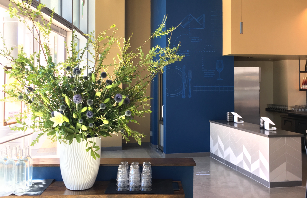
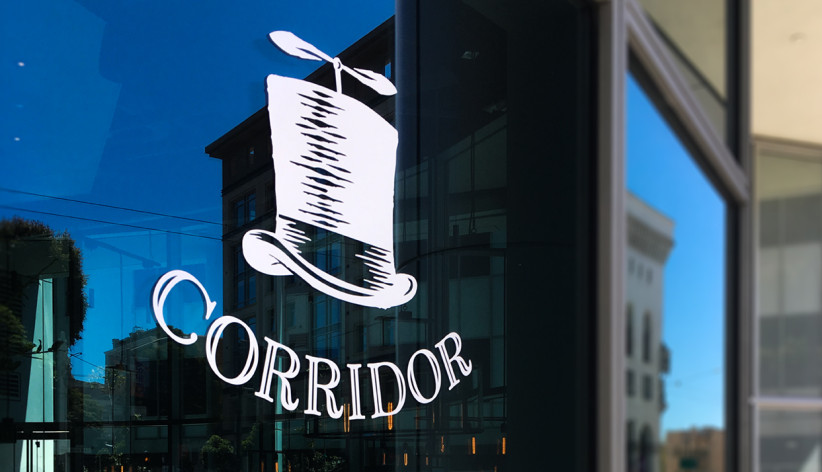
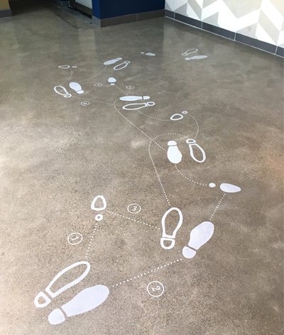
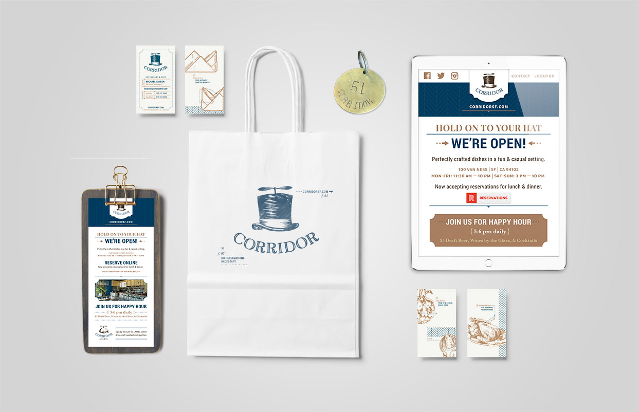
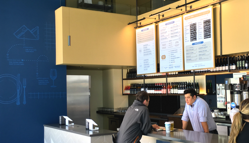
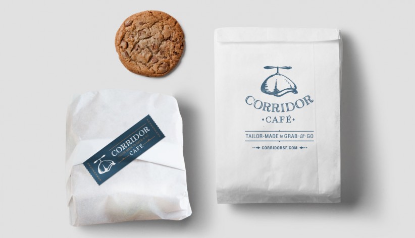
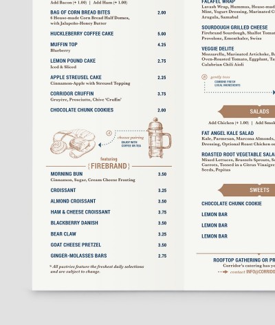
The top hat logo with spinning upper provides a natural visual meld quick service with fine dining. The café swaps in a page boy cap with spinner as a reference to reading the morning news with your fresh cup of joe. Dotted rules, instructional elements, and etching style illustrations help paint a picture of how guests can navigate this new restaurant dining concept and its experience. We even introduced dance steps onto the floor, playfully guiding visitors to the walk-up ordering system. Custom in-table menus also allow guests to continue the ordering process if they want to add to their orders after being seated. We collaborated closely with interior architects, Studio KDA, to introduce menus and murals that help detail the space.
RESULTS
Well-dressed theater patrons clearly grasp that the fine dining component comes with a twist. The Corridor concept has adjusted numerous times as the Hi Neighbor Hospitality Group has worked to find its perfect niche. However, the overall branding has been able to stand the test of time. The quirky design of the brand fits with Hi Neighbor's restaurant portfolio and the step-by-step instructional details provide strong visuals that can shift as needed to communicate evolving operational adjustments.

