CLIENT
HerbalifeBRIEF
Herbalife enlisted UNIT’s expertise to streamline their packaging approach across hundreds of SKUs with an international stage. They needed a consistent system that could translate across business segments, from face creams to protein bars, and required space for up to 4 languages on certain packs.SOLUTION
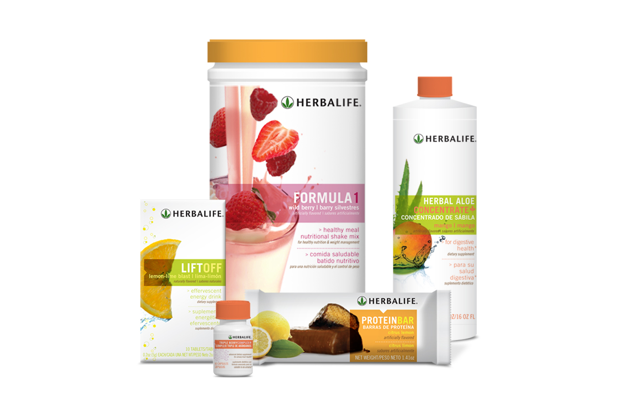
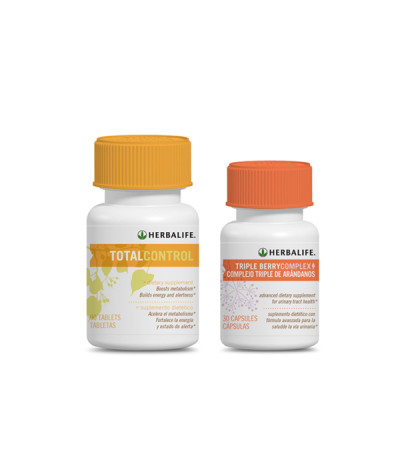
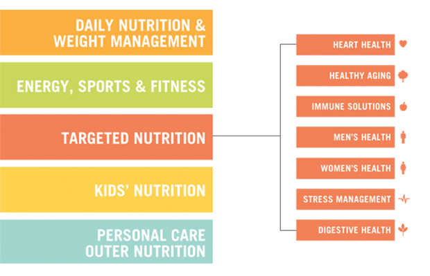
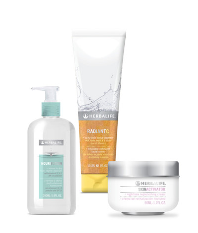
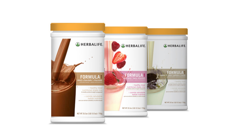
UNIT recommended a white backdrop for all packaging to showcase product and ingredient photography, while also representing the company’s clean, health driven approach. We developed styles for “active” photography for the image and product name to be the primary focal point, giving multilingual customers an easy read and allowing room for product benefits and multiple language translations. A color tab system helps highlight the brand palette, while also categorizing their various business sectors.RESULTS
For the first time ever, Herbalife has a clear, consistent style guide for global implementation. UNIT provided a system of files and a style guide that allow their internal design teams to maintain the brand as new products launch. Most importantly, consumers can clearly see what they’re buying and how it benefits their health.CLIENT
HerbalifeBRIEF
Herbalife enlisted UNIT’s expertise to streamline their packaging approach across hundreds of SKUs with an international stage. They needed a consistent system that could translate across business segments, from face creams to protein bars, and required space for up to 4 languages on certain packs.
SOLUTION
UNIT recommended a white backdrop for all packaging to showcase product and ingredient photography, while also representing the company’s clean, health driven approach. We developed styles for “active” photography for the image and product name to be the primary focal point, giving multilingual customers an easy read and allowing room for product benefits and multiple language translations. A color tab system helps highlight the brand palette, while also categorizing their various business sectors.
RESULTS
For the first time ever, Herbalife has a clear, consistent style guide for global implementation. UNIT provided a system of files and a style guide that allow their internal design teams to maintain the brand as new products launch. Most importantly, consumers can clearly see what they’re buying and how it benefits their health.

